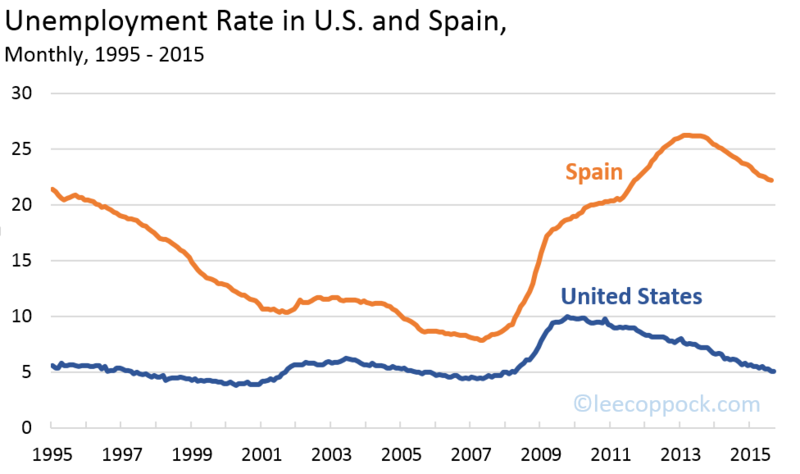
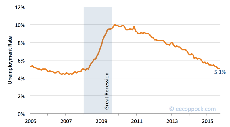
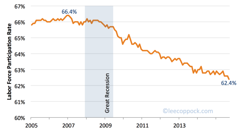
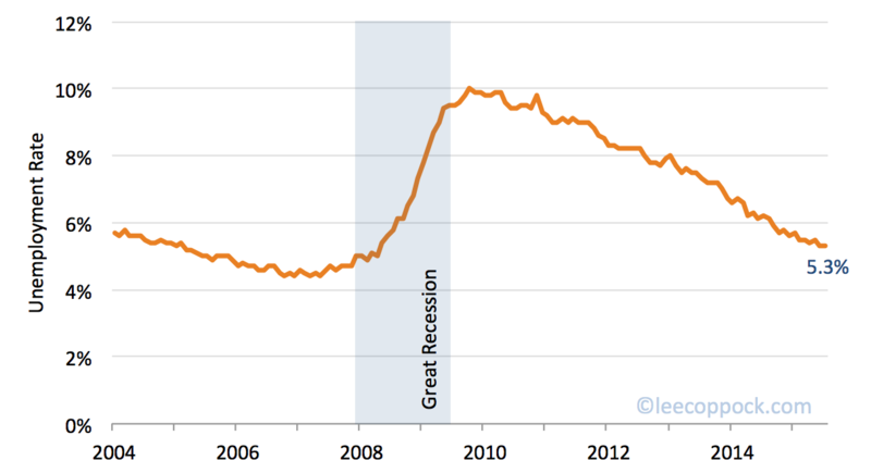
• The July jobs report from the BLS showed change in the unemployment rate (5.3%) and labor force participation rate (62.6%).  The unemployment rate since 2004 is plotted below:

     Unemployment July 2015

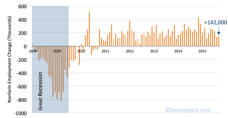
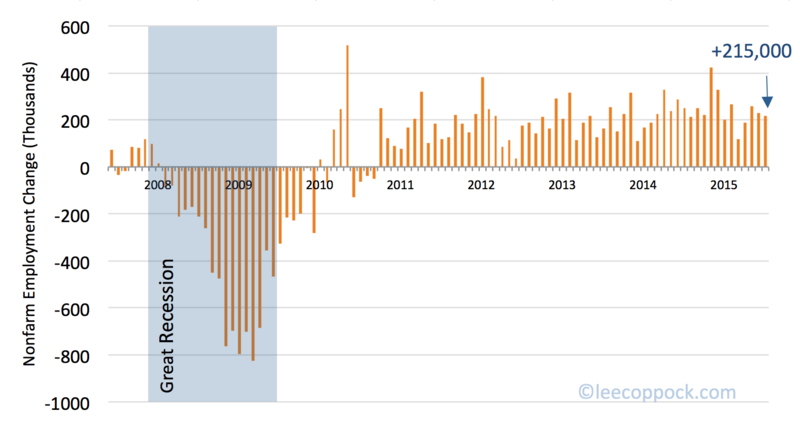
    The big positive news is the estimate of 215,000 new jobs added in the economy overall.  This continues three straight months of more than 200,000 new jobs.

    Payroll July 2015

    One last trend to watch:  although the long run trend for the U.S. economy is increasing jobs in the service sector along with relative declines in manufacturing, the July report estimates increases in manufacturing jobs.  The net change of employment opportunities in manufacturing +15,000, up from just +2,000 the month before.

  • Today, the BEA released their  first (Advance) GDP estimate for the second quarter of 2015, estimating real GDP growth of 2.3%.  These figures will be revised over the next few months, but for now, they indicate positive but pedestrian growth below the long-run historical average of 3%.  The graph below shows quarterly real GDP growth since the beginning of 2004.

     GDP 2q2015

    The big news is that the growth estimates for the first quarter of this year were revised up to +0.6% from -0.2%.  This means that the economy has had positive growth now for over a year.

    The table below shows the contributions of each of the four major pieces of GDP:

    Growth components

  • For the first time since last December, the CPI is above it's level from twelve months earlier.  The latest CPI estimates from the Bureau of Labor Statistics show an increase of 0.3% in June, and 0.1% over the year. 

    The graph below shows 12-month CPI changes since 2006.
     
    CPI June 2015


    In fact, 2015 has seen gasoline prices on quite a roller-coaster ride  – decreasing by by 18.7 % in January, increasing by 10.4% in May, and by 3.4 % in June. Given the large volatility  food and energy, core CPI is calculated omitting those prices – and core CPI increased by 1.8 % over the past twelve months.

     
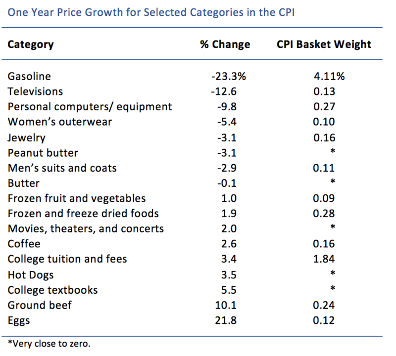
    The food index rose by 0.3 % in June, which may not seem that much – but some individual foods have experienced significant price rises. Let's hope you put more than eggs in your shopping basket, because eggs have experienced their largest increase since August 1973, up 18.3% in June alone. This egg price spike the product of simple supply and demand economics: the avian flu has caused a chicken shortage.
     
    The table below lists some examples of prices that moved positively and negatively over the past twelve months.

    Price Table June 2015


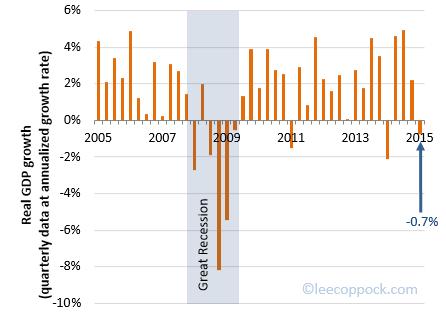
  • Real GDP in the U.S. fell by 0.7% in the first quarter of 2015, according to the latest report from the BEA.  The graph below shows growth by quarters since the beginning of 2005.

    GPD2015.I

    It seems reasonable to ask: what is wrong with the first quarter?  After all, since 2010, there have only been three quarters where U.S. real GDP has been negative – and these were the first quarters of the years 2011, 2014, and 2015. 

    Economists are of three views on this.  The first two are summarized well by Justin Wolfers here. One is that there are exogenous random shocks have hit the economy, and this has lately been in the first quarter. An example is bad weather (think polar vortex). Second, it is possible that the BEA is not correctly measuring the seasonal adjustments in the first quarter of data.  In other words, the GDP estimate is just wrong.

    Finally, Tyler Cowen posits that maybe the economy does naturally go through a seasonal cycle after all.  Perhaps this is related to a lull after the holiday season.  From this view, the first quarter downturn is accurate and should not be smoothed out of the data with seasonal adjustments.

    Whatever the case, we can all agree to hope for a large uptick in the second quarter.

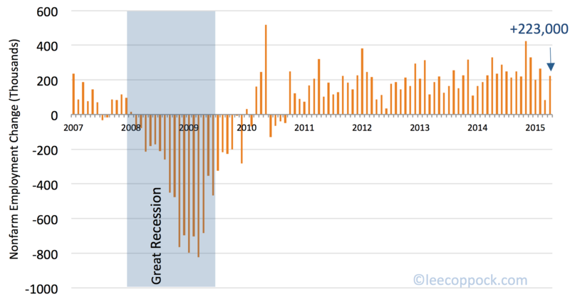
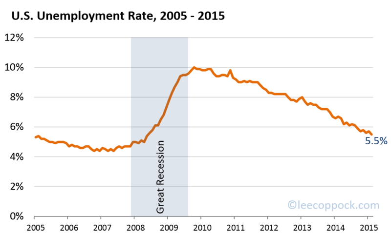
  • The economy added 223,000 new jobs in April, up from 85,000 in March. Today's BLS jobs report also estimates the unemployment rate down to 5.4%, the lowest level since May 2008.  Keep in mind, the unemployment rate was 6.2% just a year ago.

    Unemplyment april 2015

     
    You may wonder why the employment data seems to relay good news while recent GDP growth has been weak.  One possibility is that the Advance Estimate of GDP growth in the first quarter will be revised upward when we are able to evaluate a more complete data set.  Another possibility is that the employment figures will be revised downward.  In fact, in this current report, the jobs growth for March has been revised downward to just 85,000 (from the original estimate of 126,000). 
     Payroll april 2015
    Just like last month, the employment in oil related activities continued to fall. Among the new jobs 45,000 were added by the construction industry. Over the past 12 months, the industry added 280,000 jobs. This shows signs of recovery after the housing bubble in 2006.
  • The  unemployment rate in remained steady at 5.5% in March.  The graph below shows the steady decline over the past year, falling from  6.6% one year ago.  The number of long-term unemployed also stayed constant in March. However, this number decreased by 1.1 million over the past year.

    Unemployment rate mar 2015

    Jobs growth did slow in March, with just 126,000 new jobs. This is down from an average of 269,000 new jobs per month over the past twelve months.

    Nonfarm payroll mar 2015

    There is at least one very good economics lesson in this report:  Employment in mining actually fell by 11,000 jobs in March.  The BLS report states that the employment declines "were concentrated in support activities for mining, which includes support for oil and gas extraction."  Thus the lost jobs are a direct result of the falling gasoline prices over the first few months of this year. 


  • According to the BLS, the CPI increased by 0.2% in February on a seasonally adjusted basis. This is the first increase after a consecutive decline in the last three months. The index was unchanged over the last twelve months. Hence, the ups and downs in the last twelve months have evened out, so that we are at the same price level again that we had in February 2014.
     
      CPI Graph 03-24-2015
     
    Generally, the increase in the price level last month can be attributed to the sudden increase in gas prices. After a series of declines, the index for gasoline rose for the first time since July. The change from December to January was -18.7%, while the change from January to February was +2.4 percent.
     
    The food index also increased by 0.1 percent. However, the results for the past month were mixed. Even though in increased on average, three of six major grocery store group indices declined, while the other three increased.
     
    In the table below you can find the percentage of popular items in the last twelve months. If you compare the table to the same table from last month, you will notice that the growth in price is broad-based.
     
    CPI Table 03-24-2015
  • The BLS released yet another positive jobs report this morning.  Nonfarm payroll employment increased by 295,000 jobs in February and the unemployment rate dropped to just 5.5% – the lowest level since May 2008. 

    Unemp0215

    The question going forward is now: how close are we to the natural rate of unemployment?  Many economists believe this is around 5.5 percent.


  • The latest Consumer Price Index (CPI) estimates, released this morning by the BLS, indicate that the CPI fell 0.7% in January.  This marks the third consecutive month that the overall price level has fallen.  In addition, this latest decline means that the CPI is now down for the twelve months ending in January. This decrease brings us down to the price level from December 2013.

    CPI graph 02-26-15

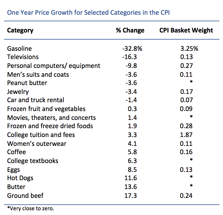
    A big part of the decrease can be attributed to falling gasoline prices. The core CPI, which excludes volatile items like food or gas, actually rose by 0.2% in January and by 1.6% within the last 12 months.

    The table below lists changes a selected group of specific price categories along with their weight in the CPI.  Since gas prices are about 4% of a typical consumer budget, they influence the overall price level more than other individual good prices. 

    CPI table 02-26-15

  • The latest jobs report from the BLS offers a great teaching lesson about how the unemployment rate is calculated.  Here's why: it is one of the best jobs reports we've had in a long time even though the unemployment rate actually went up.

    First, notice the 257,000 new jobs created in January.  As the graph below shows, we are now working on almost 5 years straight of positive jobs growth, with 3.2 million new jobs in the past twelve months alone.

    Employ0115
     

    The second piece of good news is the increase in the labor force participation rate (LFPR) to 62.9 percent.  And while labor force participation is still at historically low levels (see graph below), it seems possible that the downward trend has finally reversed as the economy is picking up steam.

    Lfpr0115

    With all this good news, why did the unemployment rate actually rise to 5.7% in January?  It rose because it is calculated as the portion of the labor force that is unemployed.  The labor force grew by over one million people in January.  And while about one-fourth (257,000) of these found jobs, the others did not, and so the unemployment rate increased.

    Unemp0115

    This tick up in the unemployment rate should not be seen as bad news.  In the long run, we want the economy to be producing lots of jobs – jobs that draw people back into the labor force from disability, continued education, and perhaps even retirement.